If you’ve followed my blog for any length of time, you probably know that I’m a planner nerd. So you have no idea how excited I was to win a contest on the Quo Vadis blog for one of the Plan and Note Planners. I’ve been coveting one of these for a long time, and this was a great opportunity for me.
In return, I promised to write a review of the planner and how I used it for bullet journaling. (But the fact is, the journal bowled me over with its quality, and the thought of bullet journaling took a back seat).
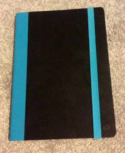
Short Review: This is a high-quality planner with extreme “touchability.” It just feels good to hold and to use. The cover texture is soft, and the pages are very smooth. It’s a joy to write on them. The order of the planner is well thought out and includes some future planning features. “Strict” bullet journalists may find the idea of using a pre-defined calendar as their journal quite restrictive. “Lazy” bullet journalists (like myself) may find it suits them perfectly.
Now for a more detailed review:
I loved this planner from the moment I received it. Black is my favorite color, but I love the blue spine and elastic band. (It also comes in violet or rose.) It’s a soft-cover planner, but sturdy enough to write on in your lap, or simply holding it in your hand. It lies nearly flat when opened. But the “touchability” of the cover won me over immediately. The texture is a soft, almost warm, material that invites you to stroke it!
The inside pages are very smooth and thin, and the quality of the paper is outstanding. I used fine Sharpies, colored felt tip pens, gel pens and even several different fountain pens, and nothing bled through. I even had a fountain pen leak and leave a nickle-sized ink splat on the pages. It did not bleed through! You could sometimes see shadows of writing on the other side of the page, especially in hard light, but no bleeding. I was very impressed. For a pen junkie like me, this is a huge selling point. I’m sold just on the quality of the paper.
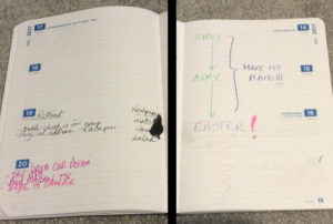
Two photos merged together here: one of the ink-splat page on the left, and it’s obverse (turned back a day) on the right.
The planner is divided into several useful sections, especially if you prefer a pre-printed, bound calendar/diary. If you’re bullet-jounaling in the traditional sense, these sections might get in your way. However, there’s lots of room for personalizing and adding to the journal.
Here are the sections:
1) 2017 – Year on One Page
This is a useful first page in the planner. I found myself using it frequently, if only to check what day of the week certain days fell on.
2) 2017- Year on Two Pages
This is one of the better layouts I’ve seen for full-year planning. Unfortunately, the space was too small for me to be extremely useful–in the traditional sense. In this size planner (6 x 8 inches), I’d like to see an option for a year on four pages just to have a little more room. (Interestingly, in the back of the book is the same set up for future planning for 2018. I found the size much more useful there, because my days weren’t so busy yet.)
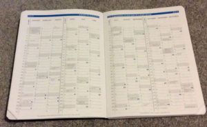
Year on Two Pages
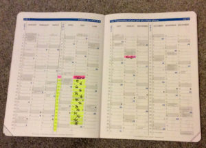
Because the space was small, I found myself “paralyzed” as to what to record here. Then it dawned on me that these pages are PERFECT for habit tracking. I like to work on one habit at a time, so I used the entire daily box to track: showing the beginning and ending dates of the project in pink, and highlighting in gold — with a star — the dates I followed the habit. But these boxes could easily be divided to track up to five daily habits (maybe more, if you use just colored dots, perhaps).
3) Monthly Calendars, one per page, printed horizontally.
I’m used to a vertical version of this and found the horizontal much more friendly, especially on busy days.
4) Week on Two Pages, January – December
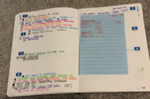
Showing a week on two pages spread, and my lazy bullet journaling…
5) Future Planning Section
I’m lumping these several pages into one section, although it spans several. It contains a monthly calendar for January, a 2018 Year on One Page, and 2018 Year on Two Pages. Interestingly, I found the year on two pages in the back “just the right size,” probably because I don’t have so much planned for 2018 yet.
6) Address Book – 9 Pages!
In the back of the book are nine pages dedicated to contact information: phone numbers, email addresses, etc. I didn’t find this section useful at all, and feel it has too many pages dedicated to it. But the pages are “college ruled” and I’ve been using them for story planning, capturing ideas and general notes. Nine or ten pages is just about perfect for this.
Because the headings are in a light gray color, the pages are easily re-purposed. This is where dedicated bullet journalists will be able to pack their spreads.
7) Lined Pages – 2
I’m not certain what these two pages were intended for. The ruling is not quite as narrow as the address book and notes here look less cramped. I’m using the pages to list the books I want to read next. It’s an excellent place for an index
What Would I Change?
This planner is a well-thought-out and highly useful traditional planner. I would combine the address book and two lined pages in the back into one generic section. To make it even more useful, I’d make it dot-grid instead of lined.
Overall, the Quo Vadis Plan and Note Planner is an exceptional planner of quality. I highly recommend it to anyone!
Where to Find Quo Vadis:
For more information on the Plan & Note planner including where to purchase: https://quovadisplanners.com/catalog/planandnote
For all Quo Vadis planners: quovadisplanners.com
Instagram: https://www.instagram.com/quovadisplanner/
Facebook:
https://www.facebook.com/Quo-Vadis-Notebooks-and-Planners-86676068578/
Quo Vadis blog has posts on time management, writing, journaling, and more: quovadisblog.com
Thank you 😀
You’re welcome!